I’m working on some artwork for our company’s christmas party invite. The theme is winter wonder land, we’ve hired some large fluffy polar bear cut outs (growly bears) for decoration and I though the invite should therefore feature a polar bear.
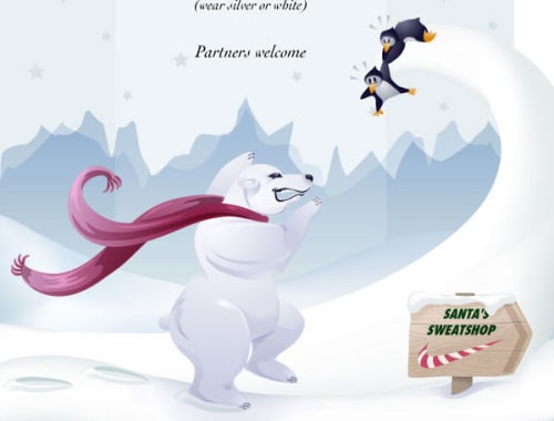
I opted for a very deceptively classy smooth Arctic background with stars, two scripty fonts, some cartoony penguins (think Japanese character stationery), dangling from and icy curly glacier with a polar bear trying to reach them so he can eat them. The polar bear is also thinking about a roast chicken as he is trying to eat the penguins.
I have received the following criticisms from my party organising colleagues before sending it out to the company.
1. The polar bear is too fierce/aggressive. Can you at least take off his claws?
How many friendly, cuddly polar bears without claws have you met?
2. I don’t get why the polar bear is thinking about chicken.
Have you been watching cartoons over the past 50 years? Man it’s a classic toon cliché!
3. But the fierce polar bear doesn’t go with the style and isn’t what the theme is about.
Obviously very new to the use of contradiction as humour.
Nothing has been said about my Santa’s sweatshop sign depicting a swoosh logo in candy stripes. I guess that one hasn’t hit the radar yet.
Maybe I’m being over protective, or these subtle things are too subtle.
GRRRRRR!!
Before:

After:


 RSS – Posts
sbszine
15 October 2004 at 10.11 am
Oooh, can we see the original and the bastardised versions?
Red Wolf
28 December 2004 at 1.56 pm
I linked the before and after designs to the post. Loved Santa’s Sweatshop and prefer the before bear, although his scarf in the after is quite cute